


COVID-19: Making sense of all the numbers


In this five-part graphic series, Al Jazeera helps you filter through the headlines and charts behind the coronavirus.
Published: 16 April 2020
PART ONE
What do we know?
Every day, thousands of headlines show the latest figures on the coronavirus. For most readers, the numbers are growing at such a dizzying rate that it is easy to feel overwhelmed.
If there was ever a time when we needed clear and reliable data, it's now.
How individuals and governments interpret and act upon this data will not only help us stay safe but will ultimately be necessary to end the global coronavirus pandemic.
THERE IS A LOT OF UNCERTAINTY

If you did not know this already, the coronavirus numbers being reported are not facts - but they’re the best we’ve got.
No single dataset exactly represents the reality on the ground. Every day, thousands of healthcare workers, government agencies and researchers are each collecting, processing and sharing what they know about the virus. The goal is to gather the most reliable data that can help people understand the outbreak as it evolves.
The more countries collect and share their experiences, the closer to reality we should get.
Al Jazeera, like many other news networks, primarily uses the Johns Hopkins University coronavirus dataset, which combines figures from the World Health Organization (WHO), the US Centers for Disease Control and Prevention (CDC), the European Centre for Disease Prevention and Control (ECDC) as well as several other local media and government sources.
PART TWO
What do the numbers mean?
The most widely reported numbers are the confirmed cases, deaths, recoveries and active cases. We illustrate what these terms mean in the section below.
CONFIRMED CASES
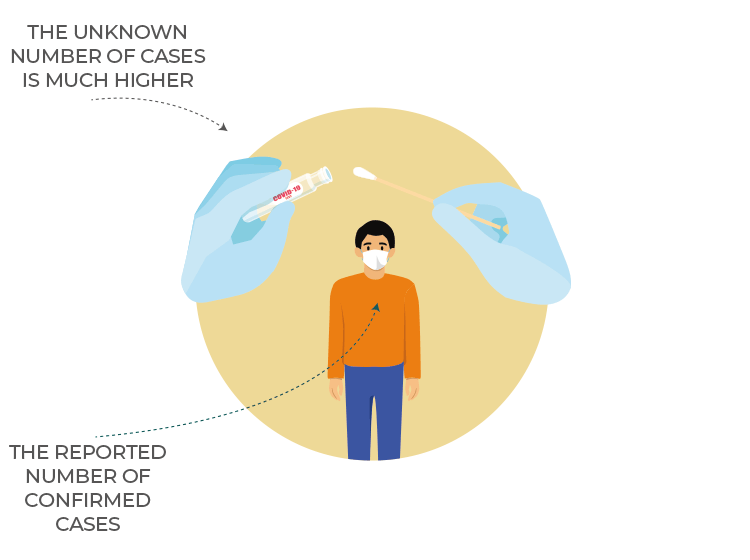
Confirmed cases are the number of people who have tested positive.
One of the stealthiest characteristics of the coronavirus is that it can be spread with little to no symptoms. This means that the number of people worldwide who are actually infected is probably much higher than the official confirmed cases.
If you have not been tested, you are not counted.
Viruses, including COVID-19, tend to spread at an exponential rate, which means they multiply really quickly. On March 6, the world had 100,000 confirmed cases, one month later there were one million, and if the virus continues to grow at this rate, this number could reach 10 million by May.
That is why governments in many parts of the world have imposed nationwide lockdowns to slow down the rate of infection or "flatten the curve".
CONFIRMED DEATHS
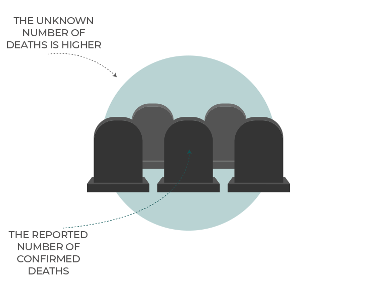
Reporting deaths is a sensitive process.
Every country has its own methods for reporting, which include reviewing a patient's medical records and informing family members before releasing any figures.
Leading infectious disease experts have already warned that, despite strict physical distancing measures, the world could still face hundreds of thousands of deaths - if not millions.
Just like confirmed cases, the actual number of deaths is almost certainly higher than what is being reported.
Several reports have also emerged of undercounting. These include many cases where people are dying at home despite showing unmistakable COVID-19 symptoms.
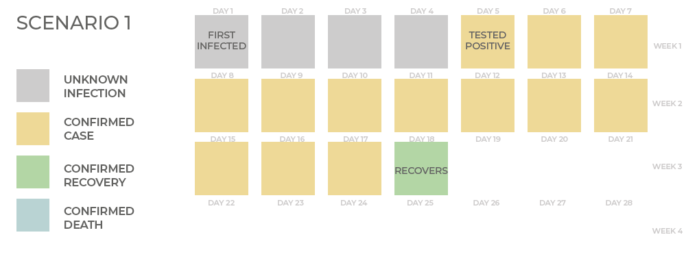
THE LAG EFFECT
What we are observing today is a result of actions taken a few weeks ago.
A reduction in infections today should lead to fewer deaths weeks from now.
HOW DANGEROUS IS THE VIRUS?
If someone contracts COVID-19, how likely is that person to die?
At the start of the outbreak, a lot of attention was focused on comparing the death rate from COVID-19 to the death rate for other known diseases. While this number is hugely important for us to grasp how concerned we should all be, it is easily miscalculated.
Epidemiologists, who study health and diseases, have two measurements to calculate the risk of death, the case-fatality-rate (CFR) and the infection-fatality-rate (IFR).
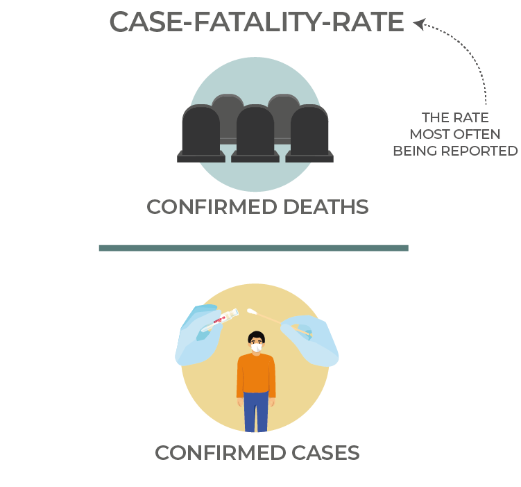
The case-fatality-rate (CFR) is the proportion of people who die out of those who test positive.
If 100 people test positive and 10 people die then this makes the CFR 10%. The big problem with this number is that unlike most other diseases that have ended, new COVID-19 cases and deaths are being reported every day.This makes COVID-19's mortality rate a moving target.
Every country has its own mortality rate. Italy's case-fatality-rate is about 12% while Germany's is 1%. The virus itself is not more potent in Italy, but rather the differences can be explained by how rigorously countries are testing and counting the number of infections and deaths. A country's age demographic and healthcare infrastructure have been shown to play a role in determining this number.
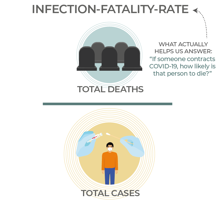
The infection-fatality-rate (IFR) is the proportion of people who die out of the actual number of people who were infected.
If 1,000 people have COVID-19 and only 100 of those test positive, then if 10 people were to die, the (IFR) would be 1% - much less than the case-fatality-rate (CFR), but still higher than the seasonal flu.
The infection-fatality-rate is the mortality rate most of us are actually looking for.
As several reports have suggested, COVID-19's infection-fatality-rate is probably lower than initially estimated, mainly due to many cases going undiagnosed.
CONFIRMED RECOVERIES
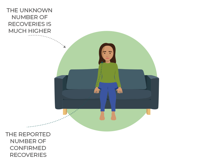
The overwhelming majority of people who contract COVID-19 get better. According to the WHO, the virus typically lasts about two weeks for mild cases and three to six weeks for serious cases.
It is important to remember that most coronavirus cases are mild.
Keeping an eye on recoveries should help avoid unnecessary global panic and help individuals better understand the risks to themselves and their community.
There is a lot of uncertainty in calculating this figure. So much so that Johns Hopkins University temporarily suspended its reporting of recovered cases citing "no reliable data source reporting recovered cases for many countries, such as the US" , before resuming its tally a few days later.
CONFIRMED ACTIVE CASES
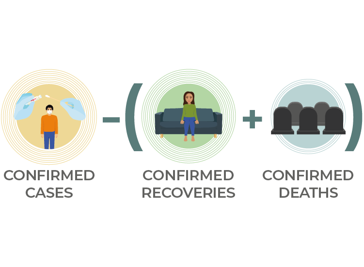
If you want to know how many people are currently infected, you need to take the number of confirmed cases and subtract those people who have recovered or died from the virus.
Even if a country currently has a low number of confirmed cases, it is important to keep in mind that most countries show very similar traits in how the disease spreads. Initially, the numbers may seem small, but due to the virus's exponential nature, the numbers multiply quickly.
In an ideal situation, extrapolating patterns from countries with early outbreaks, including China, South Korea and Italy, would help other countries inform their respective response strategies. The problem is that, especially in the case of China, there have been accusations that the official figures underreport the number of cases.
Which number is the most meaningful to you?
CLICK TO SELECT
Cases

Deaths

Recovered

Active cases

PART THREE
What do all the maps and charts mean?
The purpose of a map or chart is to take a lot of information and make it easily digestible. Different charts have different meanings. No single chart can communicate everything about how COVID-19 behaves. Even the choice of the x and y axis can give readers a very different understanding of the data.
Generally speaking, maps can tell you what is happening around the world right now, while charts tell you what has happened over time.
Below are a series of maps and charts from OurWorldInData.org - a comprehensive resource that aggregates data from various international sources. Use the built-in filters and tabs to select your country.
Questions this chart answers:
Q. How widespread is the virus?
A. Click on the map tab to see the number of new cases reported each day. Remember, this is lower than the actual number of people infected.
Q. Which day had the most new cases?
A. Technically it is the highest value on the y-axis but do not read too much into this. General trends matter more.
Questions this chart does NOT answer:
Q. How many people were infected today?
A. This map only shows you the number of people who tested positive today. This excludes everyone else who may have been infected or may have symptoms but was not tested.
Q. Are countries with fewer reported cases doing well?
A. It depends. If these countries are not sufficiently testing or sharing their data, they may have many more undiagnosed cases. See the test rates chart below.
Does this chart improve your understanding of the global pandemic?
CLICK TO SELECT
YES
NO
Questions this chart answers:
Q. Are the number of deaths increasing or decreasing?
A. To answer this, you will need to look at the overall trends. If the slope is moving upwards, then deaths are increasing, if downwards then they are decreasing. Do not draw conclusions based on looking at daily changes on their own; these can differ based on how the data was collected the day before.
Questions this chart does NOT answer:
Q. How many total deaths have there been worldwide?
A. You would need to look at a cumulative chart to better answer this.
Q. Why do certain countries have more deaths?
A. Charts are not very good at answering the question "why".
Does this chart improve your understanding of the global pandemic?
CLICK TO SELECT
YES
NO
Questions this chart answers:
Q. Which countries are testing the most?
A. Countries higher up on the list are testing more people relative to their populations. Normalising the data per 1,000 people is more meaningful than showing absolute numbers.
Questions this chart does NOT answer:
Q. Are the number of tests increasing worldwide?
A. There is no standardised global measurement for testing. Test units vary significantly across countries, so be careful when comparing data.
Does this chart improve your understanding of the global pandemic?
CLICK TO SELECT
YES
NO
PART FOUR
How quickly has the virus spread around the world?
The first reported coronavirus case was a 55-year-old individual from Hubei province, China, on November 17, 2019.
The virus quickly spread around the region and then the world. On March 26, the US overtook China and currently has the highest number of confirmed cases worldwide.
The animation below shows how the virus spread globally.
PART FIVE
Are we winning or losing the fight?
The question on a lot of people's minds right now is how do we measure if things are getting better or worse each day?
One way is to compare the weekly rolling averages.
This allows you to see if the number of new infections this week was higher or lower than last week.
Questions this chart answers:
Q. Is my country getting better or worse?
A. Select your country from the menu on the bottom left. If the graph is trending downwards, then the rate of deaths is decreasing. If the graph is trending upwards, then the rate is increasing.
Q. Why is my country not included?
A. This graph only shows countries that have reported at least five deaths.
Questions this chart does NOT answer:
Q. How long will the lockdowns last?
A. The graphs show you seven-day rolling averages. These averages adjust the slope of the curve on a daily basis and are affected by real-world actions such as social-distancing and quarantines.
Be careful not to naively extrapolate values today for what will happen in the future.
Does this chart improve your understanding of where we're heading?
CLICK TO SELECT
YES
NO
When do you think this will all end?
ALSO READ
What happens when coronavirus hits refugee camps?

Coronavirus testing methods: What you need to know

Will the global economy recover from COVID-19? | Start Here
Coronavirus: All you need to know about the symptoms and risks

How does coronavirus spread and how can you protect yourself?

Coronavirus: Which countries have confirmed new cases?

© 2020 Al Jazeera Media Network.
Produced by: Mohammed Haddad and Alia Chughtai for @AJLabs